Welcome to week 2 of Project Opus! If you’re just tuning in, we’re creating a conceptual AI product from the ground up in 10 weeks. Last week the project kicked off and we defined the solution’s success criteria, identified and researched potential target markets, and organized findings into what we call Innovation Blocks. Head here first to see what went down in detail.
This week was another one stacked full of collaboration and ideation. At a high level we:
- Created MicroDesigns based on foundational research
- Had a team Brainstorm
- Organized MicroDesigns into common themes and finally zeroed in on a use case to pursue (yay!)
- Started sketching initial concepts
- Began research prep and created an initial survey to be sent out Monday
Before we give a detailed recap of week 2, let’s remind you what it is we’re creating.
Product Concept
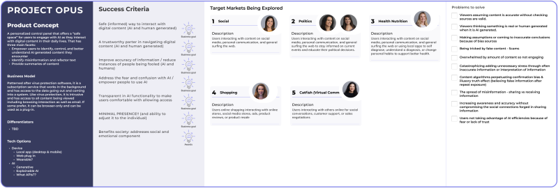
A personalized control panel that provides a "safe space" for users to engage with AI while interacting with digital content. It empowers users to identify, control, and understand AI-generated material.
Target Markets Being Explored
Social Media, Politics, Health & Nutrition, Shopping, Online Communication
Now, let’s take a deep dive into what we accomplished in Week 2!
Last week ended with everyone presenting foundational research on user behaviors, emotions, and challenges in their assigned target market. Across the opposing markets, common themes and behaviors emerged around how people consume and navigate digital content, as well as their motivations for being online and the types of information they seek.
These themes were organized into differing perspectives:
- Quick, digestible info vs. detailed, impactful content
- Simple answers vs. personally engaging material
- Seeking confidence vs. catastrophizing information
- Needing guidance vs. independent decision-making
- Story-sharing vs. information avoidance
Organizing our foundational research into these common behaviors and tension points set the stage for us to start our next step, ideation. With these common behaviors in mind, we dove into our ideation process using our Innovation Equation™ to translate the business goals and research findings that were defined last week into what we call MicroDesigns.
A MicroDesign is a solution that lets you quickly create design ideas for a single business goal and a specific user behavior or emotion. This is the equation:

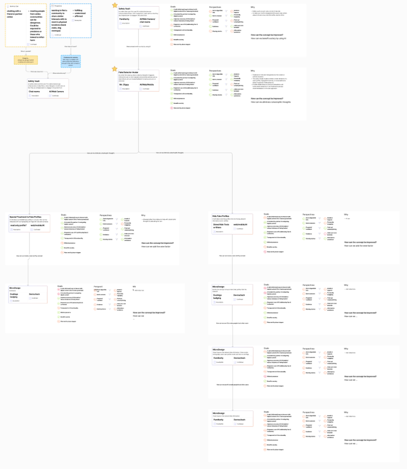
The goal at this stage is to ideate as many concepts as possible from different viewpoints, riffing on a single idea until you have a solution that satisfies as many perspectives and goals as possible. It’s a fast way to spark multiple ideas, leveraging inspiration from familiar things around us and seeing if there are creative ways they can satisfy what we are setting out to do. It allows us to think big first, without being bogged down by trying to come up with specific features. When you’re done, it looks a little something like this:

Each team member created 15-20 MicroDesigns to explore different ways the product could take shape. All MicroDesigns were organized on Figma, and in the end the board was full of ideas. This is just one half of a single target market out of the five we brainstormed.
“My biggest challenge during the MicroDesign activity was my instinct to accelerate the process into immediate solutions rather than allowing my brain to think creatively and brainstorm outside of the box, even if the thought didn't make sense at the time.” –Celeste Alcon, Senior UX Designer
We’ll share a deep dive about our Innovation Equation™ in a future post, but for now, just know that MicroDesigns make up the meat of our process to quickly gather diverse ideas and untraditional ways of solving problems for users.
On Wednesday, the team came back together to present the top 5 MicroDesigns from our assigned market (social media, politics, health, online communication and shopping). One of the rules we had was to share at least one weird idea even if it is not practical. And out of the box they were.
Here’s a taste of what some of them looked like:
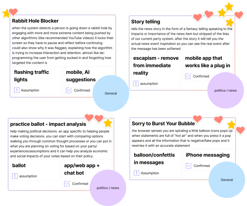
- Storytelling for Political News: Using fiction as a method of presenting unbiased news in politics through fictional narratives and characters allowing people to form their own opinions and combat immediate polarization.
- AI Algorithm Detector: Using familiar concepts (like Spotify Wrapped) that openly show users what influences their algorithms, how it’s changed over time, and lets them manually update their preferences.
- Crystal Ball: A whimsical concept that features a crystal ball icon next to AI-generated content allowing users to "peek and see", getting insights into how the content has been altered by AI and original, unaltered sources to explore more.
Our design ideas ranged from practical to wild, all with the goal of enhancing user trust and transparency in digital spaces where AI content is increasing. We then grouped and voted on our favorite concepts. The standout solutions empowered users to take control of their algorithms, better understand the information they consume, and break negative behavior patterns. They addressed key problems like combating bias and misinformation, preventing information overload and scams, and curbing doomscrolling.
Here’s a look at just some of the team’s favorites.
“Really cool social dynamics and behavioral aspects came up in the brainstorm. A lot more psychology has come into this than we originally imagined just because the way we interact with content, the way we digest information, and the way we share it is so interwoven with that. It’s been a really interesting and exciting time ,and we now have the top 2 concepts we’re going to pursue.” –Ashley Nicodemus, Design Director
The breakthrough moment that came out brainstorming was the decision to pursue Politics as our primary use case. Given we only have 8 weeks left to make magic happen, we had to zero in on the target market we wanted to tackle.
This decision was based on 4 key factors:
- Timeliness: Politics is highly relevant right now, especially with US presidential elections happening.
- Bias and Misinformation: Politics is a space that often experiences misinformation, biased algorithms, and emotionally charged interactions. Our solution could offer ways for people to feel empowered and informed with all the information they need to navigate these challenges.
- Polarizing Emotions & Behaviors: From doomscrolling to party divides, politics can trigger extreme online behaviors and in person interactions. Such a polarizing topic makes this solution one that’s challenging to create but worthwhile doing.
- AI & Algorithms: In this space, AI is both a tool and a weapon. Algorithms drive people deeper into echo chambers or influence opinions in subtle ways, often in ways they don’t even realize. Creating transparency, trust, and awareness around what is AI generated, altered, or incorrect and why is crucial.
Currently, the design team is off sketching and wireframing 2-3 initial concept for this use case and exploring it in the context of both US and the EU markets. Next week, we will share a full breakdown of each concept, what problems they solve for, and key features within them.
In parallel to all the design and ideation work that happened this week, our user researcher, Alice, began preparing for the first round of research. We’ve allotted for 1 round of quantitative research, and 2 rounds of remote user testing to gather insights from users on design concepts. As a first step, Alice created a survey to gather insights on our political use case, to uncover how people feel about the news they consume, how they interact with politically driven content, and emotions they experience when encountering AI and political material.
The survey is scheduled to launch on Monday. It will inform next steps in our product design and double as screener for the 2 rounds of remote user testing.
For this project we have set out to share it all—the wins, the pivots, the milestones. So, without further ado, here are this week's highs and lows.
- Challenges: Getting comfortable with generating ideas during the MicroDesign activity that might seem “bad” or impractical. The process is meant to encourage rapid ideation and guide novel ideas. At first it was unnatural, and it was tempting to jump straight into realistic features and think through how feasible they would be. Makes sense as designers, but it was fun to break from that traditional thinking and think bigger picture.
- Wins: We narrowed down our target use case to politics, which finally gives us a clear direction to move forward with for concept creation. It’ll be fun to see how we adapt some of the MicroDesigns in this context.
- Whoops: Let’s just say we had a few wild ideas that didn’t quite land. But hey, that’s all part of the creative process!
Next week, we’ll begin creating storylines for our political use case and start sketching out initial designs. Our first internal review is scheduled for next Wednesday, where the designers will present the 2-3 low-fidelity concepts to the team. We’ll also be launching the survey and will report back on how that shakes out.
That wraps up Week 2! Stay tuned for next week’s update as we move closer to bringing Project Opus to life.

