Seizure Safe Profile
Removes autoplay, animations and flashes
Welcome to the Week 7 recap of Project Opus! We have one more round of testing (Yes, you read that right… More testing.) to complete before we head into the final design stretch of the project. Our focus this week was split between updating designs based on previous focus group feedback, finalizing a storyline for this week’s user research, research prep, and recruitment. Oh, and we also conducted 7 in-depth interviews (IDIs).
The week went by in the blink of an eye and it was all hands on deck. Here’s what we’re covering in this week’s recap:
Let’s dive in!
The beginning of the week was spent finalizing the test plan and recruiting participants to interview for Thursday and Friday’s sessions. We were looking to run 7 remote user interviews, each 90-minutes, and sought to recruit a range of participants. From those politically disengaged individuals to those who actively keep up with political news. Their engagement with political content varied widely, some reporting that they form opinions ahead of elections and others interested in consuming political content simply to stay informed.
Our main goals for this final round of user research were to apply the design changes from previous rounds and allow users to explore and interact with a working prototype. We also wanted to uncover:
To gather all these insights within the 90-minute sessions, the test plan was broken up by each feature with subtasks and data collection goals within the prototype for each screen. While our researcher, Alice, got to work finalizing that test plan and recruiting seven all new participants, the design team was busy getting the product screens ready.
Design had 3 main goals at the beginning of the week in preparation for testing.
From the insights uncovered in the previous tradeoff testing focus groups, we updated the designs and applied the look and feel to new screens to be able to create a prototype for testing. We did run into a few hiccups with prototyping in Figma.
Some of the design screens with adapted look and feel were created in Illustrator and brought over to Figma, which posed a challenge when prototyping certain components. Because testing was only a few days away, we needed to leverage higher fidelity wireframes in some cases.
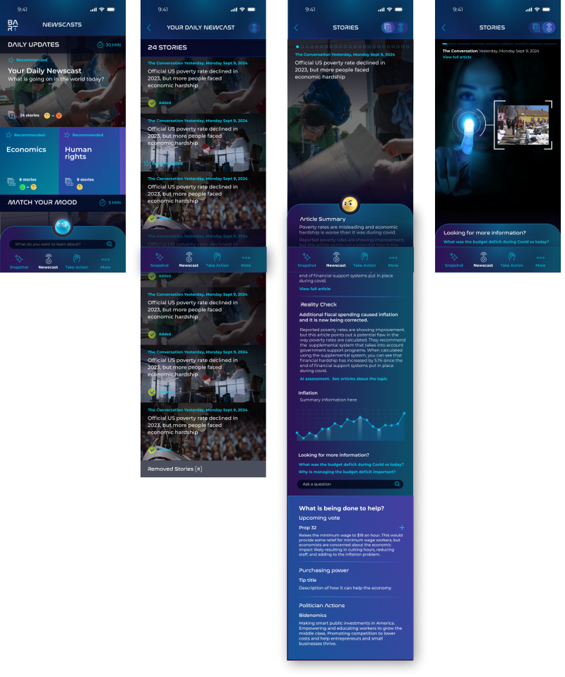
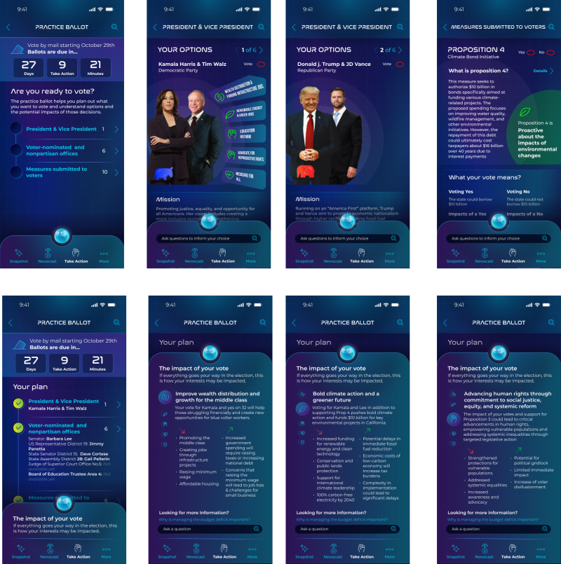
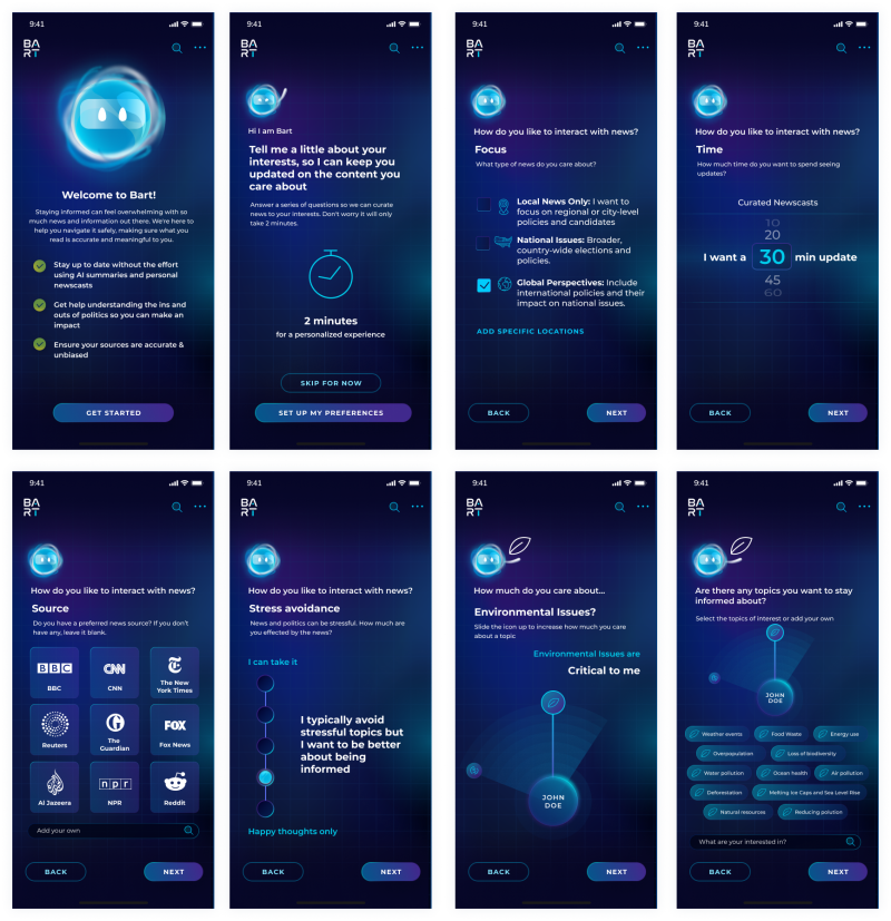
It was all hands on deck leading up to the 7 remote IDI sessions on Thursday and Friday. Throughout the sessions, participants interacted with the tool’s onboarding flow to gather political preference and interests as well as 4 core features: Daily Snapshot, Personal Newscast, Content Analysis, and Practice Ballot. For each feature and subtask, our team observed how participants navigated through the tool, engaged with AI-features like article summaries and AI detection, and uncovered how well the design fostered trust.
Research Goals for Each Feature:
1. Daily Snapshot
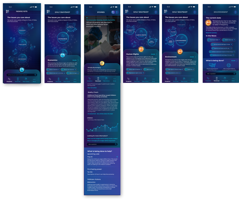
2. Personal Newscast
3. Practice Ballot
4. Content Analysis
The design team also built out the onboarding sequence and added more color to the process to help users understand during testing how the app can be used to their benefit and get them on board with the idea of selecting topics and the level of interest within politics.
The research team is off synthesizing the findings and writing a research report, which they will share in a report readout with the whole team next week, but some clear findings have already emerged. The design team sat in on the live sessions and is already reacting to feedback collected.
High Level Takeaways
“I would like to be able to choose the content I am interested in following—curated content based on my expressed interest, not on search history.” -Participant #7
“It’s very important for me to be not biased and to have an open mind, and one of the ways [to do that] is to be able to see the multi-facet of issues.” -Participant #3
Since this was the final round of testing, we wanted to hear what the team was surprised by as they sat in on the IDIs. Here’s what they had to say!
“These sessions have shown me that most people are not ‘afraid’ of AI, they just want to make sure that if they are using it, it is specific enough to address their needs. Having a simplified summary with top highlights in articles isn't enough to drive a need for something like our tool, so I'm excited to explore how we can make it even more resourceful.”
– Celeste Alcon, UX Designer
“I wasn't expecting the newscast feature to be so popular, but it makes sense—for a lot of participants, the sheer amount of news sources out there requires so much work to go between and you must be diligent if you want to get well-rounded information. so having a tool that can pull all of that and take that burden off was valuable to people.”
– Sarah Field, Product Manager
That’s right! During testing and throughout the design, we’ve been calling the tool and the personified character that’s with users at each step, Bart. Why? Well, if we’re being honest, we just needed something general to use in testing, but the name never felt right and didn’t resonate with participants.
We’re excited to share we’ve given our AI tool and helper a new name—Poli! Your tool for unbiased political engagement, powered by AI-driven transparency.
With only a few weeks left in the project, the finish line is in sight. Next steps involve synthesizing the IDI research findings and presenting them to the team and enter the final design stage. We’ll be finalizing visual design, all screens based on research findings, and then moving to rendering the final design.
We’re nearing the end, but we have a lot of design work still ahead to bring this project to a close. If you’ve been following since Week 1, we hope you’re excited by this project’s evolution, and we can’t wait to share the final product.
If you’re just tuning in, get caught up on weeks passed through the writeups below and follow us on LinkedIn to view video summaries!
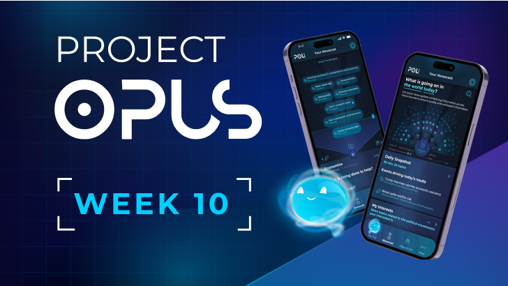
Project Opus: Week 10
Nov 08, 2024
The end of Project Opus is here! See the final Poli product in action by watching the product demo video.
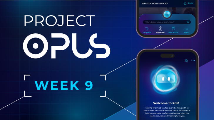
Project Opus: Week 9
Nov 01, 2024
There's only 1 week left of Project Opus, and while the team is off creating the final prototype and product demo video, we're reflecting on how the last 9 weeks went. Check out what the team had to say about the project's highs and lows.
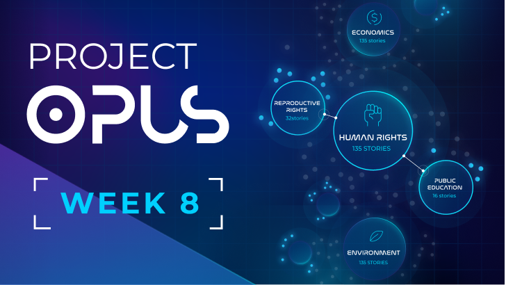
Project Opus: Week 8
Oct 25, 2024
This we met as a whole team twice, once for the user research report readout and again for the final internal design review. It was a big week as we are just 2 weeks away from the project deadline! Check out how the IDIs are impacting the design and what the team had to say.
Project Opus: Week 6
Oct 11, 2024
Week 6 was a busy one that saw more parallel work between our design and research teams! A research report was finalized, we've identified the concept to move forward with, and there are a handful of design changes to make. Check out all that happened this week!
