We only have 2 weeks left in Project Opus! That’s crazy to be writing out. This week’s recap is a long one, so we’re going to jump straight into it! If you need to get caught up on any of the previous weeks, head here first!
This week we’re recapping:
- In-Depth Interview Research Report Readout
- Design Implications
- And the final internal design review with the team
Let’s dive in!
Last week we conducted 7 in-depth interview sessions for the final round of user feedback in this project! It was the last time we were going to be able to put our designs in front of users to gather feedback on the design, flow, and usability of the app.
We went through the onboarding and 4 key feature flows: Daily Snapshot, Personal Newscast, Content Analysis, and Practice Ballot. The main goal of this final round was to understand if:
- The right level of detail is shown in AI summaries and annotations
- The overall navigation through the app was seamless and intuitive
- The tool helps individuals feel more informed on politics and political news
We had a research report readout on Tuesday to give the design team a couple days to react to the information and begin making design changes ahead of Friday’s internal design review.
The 60-minute IDI sessions were extremely informative and helped us gather the last usability and design changes to implement in the last 2 weeks of the project. Let’s look at the key findings from each of the design features tested.
- Onboarding: Overall, the customization options were seen as innovative and valuable to creating a personalized experience within the app, but when selecting news sources the app would pull from, users felt the options were still limiting.
- Key takeaway: While a personalized app experience is wanted, it was too much to gather all the customization questions in the initial onboarding flow. The design team will be breaking up customization questions to be asked throughout the app in moments where those specifics would provide value for where they are in the app the first time.
- Daily Snapshot & Personal Newscast: These features share overlapping goals and can be consolidated to streamline the user experience, striking a balance between providing detailed content summaries when needed and quick, with direct access to information in other moments.
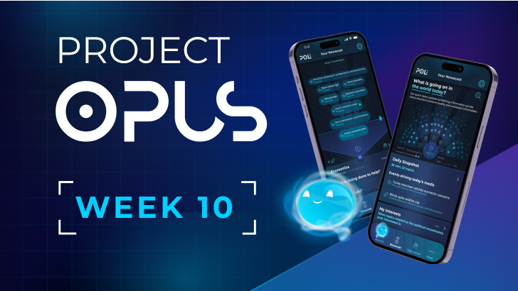
- Key takeaway: Data visualizations, like the solar system graphic, used in the Daily Snapshot left users feeling impressed by the visual but ultimately lost on what the dots were meant to communicate. The dots represented political stories and information within each of the topics and how many issues weres being talked about that day, but it wasn’t immediately clear.
- Key takeaway: More emphasis and explainable AI is critical around sources. Participants want to know where the information is coming from (especially in moments like AI summaries), how the sources translate to what they are seeing within the app, and the ability to dive directly into sources and articles used for additional discovery.
- Content Analysis: Additional clarity is needed around Poli’s role in the plug-in feature. Participants were skeptical and confused with its functionality, especially in moments where it called out “Reality Check” information.
- Key takeaway: Terminology and design element naming within this feature, but across the tool overall, is critical for this to be an unbiased source. The moment the users feel the Poli is taking a political stance, it discredits the entire experience, and users become skeptical of the information presented.
- Key takeaway: The “Reality Check” pop-up, which was intended to provide individuals additional context on what they are reading and counter arguments from multiple sides, needs to be to avoid suggesting bias or implying a definitive truth, especially in contexts that are subjective, personal, or contentious. A more neutral name will foster trust and encourage engagement without alienating users.
- Practice Ballot: This feature was seen as extremely valuable, and participants expressed excitement in a concept that would inform them of ballot information for both policy and individuals in one place.
- Key takeaway: More clarity is needed around color usage on icons and keeping that consistent throughout the app experience. Again, terminology is critical in moments like this in the application to make it clear to users what the information is meant to be communicating to them. It’s not good vs. bad or pros vs. cons, because that information is subjective. The language needs to stay neutral to simply providing multiple viewpoints to users and showcase how candidates and/or policy align with political issues they value most.
Beyond feature-specific insights collected, high-level takeaways to apply across the application were also shared.
- Rethink Emotional Indicators: Users found mood-based emojis unnecessary and were uncomfortable with the system attempting to predict or influence their emotional response to news content. Instead, Poli should be more focused on communicating what the AI is doing and how it is assisting users rather than predict for them.
- Clarify Emotional Impact: Clearly define how stress and negative emotions are measured. Emotional responses vary depending on individuals lived experiences; a one-size-fits-all emotional framework risks misalignment with personal responses and nuanced events.
- Emphasize Trusted Sources: Participants are comfortable with AI in general, but political content presents unique challenges around bias, misinformation, and polarized perspectives. AI-generated summaries can simplify complex topics, but their effectiveness hinges on user trust. To build that trust, it’s essential to clearly disclose the sources behind these summaries and explain the reasoning and criteria driving recommendations.
- Visual Design: Participants want to see a simplified interface, feeling the tool was overdesigned in moments and leaving some data visualizations unclear. Typography needs to be revisited for legibility and a less “outer space” feel.
The design team did sit in the IDI sessions last week and were able to get a head start on addressing high level takeaways and design implications in parallel to the formal research report being prepared. After the research readout, we got to work making the design changes and exploring alternatives for larger elements, such as a new data visualization for the Daily Snapshot to replace the solar system approach that didn’t land with users.
We held an internal design review with the entire team on Friday. These internal reviews are an opportunity for the designers to get a "gut check" on change directions, ensuring that we’re on the right path. Sometimes it’s hard to see the forest from the trees, so these meetings are crucial to ensure feedback is being applied impactfully while challenging ourselves to create breakthrough solutions.
The designers presented changes to all features based off testing insights. This was also going to be the last review meeting for the project as a whole team before finalizing the designs.
Luckily there weren’t any earth-shattering direction changes, and the overall feedback was positive. Discussion really came down to how to further refine and look for moments to add additional value. Key discussion points:
- Ensure We Stay Neutral: We need to continue checking the tool details bias. This tool is intended to offer multiple viewpoints in a neutral manner, and it’s crucial the team regularly pauses during this last stretch to confirm the tool is remaining neutral and aligning to what we initially set out to do.
- Moments for Additional Trust Building: The designers were exploring additional characters to introduce into the app, but ultimately the feedback was they are distracting and feel misplaced. The Poli character that appears throughout the app is an opportunity to foster a relationship with users. It should morph and change but remain consistent as the same character rather than shifting into different personas. The consistency will help build trust, communicate that it’s the technology evolving and working, and emphasize that Poli is a partner guiding them through the experience.
- Introduce Intermediary Steps in the Practice Ballot: Currently, many screens dive straight into the details (ex. what a candidate’s stance is, how it aligns or does not, etc.). There’s an opportunity to offer users a quick overview of what’s most relevant or aligned with their interests first before diving into the granular details.
We only have 2 weeks left in Project Opus! Next week is final design refinement based on the internal design review feedback and then we move into rendering the final design screens and creating the final prototype!
That’s it for this week’s recap. Stay tuned for next week!
Check out the weekly writeups below and follow us on LinkedIn to view video summaries!
- Week 1 Writeup & Recap Video
- Week 2 Writeup & Recap Video
- Week 3 Writeup & Recap Video
- Week 4 Writeup & Recap Video
- Week 5 Writeup & Recap Video
- Week 6 Writeup & Recap Video
- Week 7 Writeup & Recap Video


