Seizure Safe Profile
Removes autoplay, animations and flashes
Week 6 was a busy one that saw more parallel work between our design and research teams! While research wrapped the report for the 2 rounds of tradeoff testing, the design team got to work refining product direction and updating screens based on what feedback gathered.
Tradeoff testing revealed that users want to see a combination of elements from both designs presented (Guided vs. Passive). We are moving forward with a unified approach, taking the most successful elements from both concepts.
What we accomplished this week:
Let’s dive into the details!
Our designers observed tradeoff testing live to be able to jump straight into making design refinements. The research report allowed us to document all findings and give the design team a place to refer back to along with recommendations on how to apply insights to our evolving product.
As a reminder, in tradeoff testing sessions we present two vastly different design approaches to illicit immediate reactions from users, allowing us to understand what they prefer from each and why. In this case, one that was highly guided, offering clear instruction and a traditional web-app experience, and another more passive approach that allowed users to navigate 3rd party sources at their own pace, operating silently in the background as a web plug-in.
Politics is an Emotional Experience
People want to get more involved in politics and topics that matter to them, at local as well as national and global levels, but there is so much information out there it becomes overwhelming to navigate, sometimes to the point people feel completely frozen. It became clear the true value we can provide is helping people navigate the space along their emotional journey with politics to help them feel seen, understood, and empowered.
Users saw value in elements of both concepts that help them save time and do a lot of the leg work for them when it comes to understanding what’s real, what’s not, and breaking through the noise. Therefore freeing up time for them to learn more and form educated options about topics they care about, whether they have a quick 20-minute break or hours to dive deep.
Beyond emotions, 3 themes emerged from testing, each with impacts on how the design will move forward.
1. Dynamic Guidance Tailored to Context
Participants wanted a mixture of both concepts when it comes to varying levels of guidance and content curation. That level of guidance wanted is dependent on the context of what the user is doing and their primary goal in that moment. For example, the information they want to see when they are scrolling during a short break mid-day is different than what they want to see when they have significant time to sit and research.
2. Saving Time for Users
Participants see a lot of value in elements that help them vet what they’re looking at. Features like real-time fact-checking and content summarization help cut straight to quality content and tune out the noise. Participants believe this tool would help them save time that would have otherwise been wasted on biased or false information.
And when it comes to voting, features like the “Daily Snapshot” and “Practice Ballot” also help save time when researching issues on the ballot, but the design needs to provide more access to digestible, quick summaries that still offer users control over the depth of their engagement.
3. Effectively Framing and Simplifying Complex Content
Participants saw the use of AI capabilities in politics as beneficial to getting people more informed and engaged. Features that help simplify and explain complex topics, like convoluted props on ballots, were highly valuable and seen as having an immediate positive impact. Features like the “Practice Ballot” had helpful aspects, but the overall impacts weren’t clear enough in the screens and disjointed experience.
The insights collected from testing revealed elements from both design concepts should be combined into a unified approach to maximize the value as individuals look, browse, research, and engage with political content.
We are moving forward with a web-app solution that also has a plugin feature. Having both elements will allow individuals to cut through the noise to get informed on what they care about while still having something actively monitoring information as they browse 3rd party sources on their own.
Let’s take a look at the design implications for the 4 main features and how we’ll be moving forward.
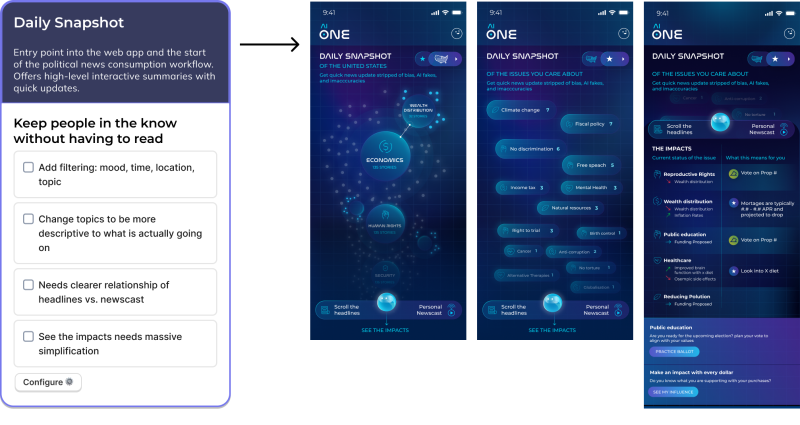
Daily Snapshot
This will serve as the entry point as a web-app and the starting point for political news consumption. It offers quick, high-level updates in an interactive summary format of what users have specified they care about most.
Pictured left: the design work that is needed now; Pictured right: the design screens that were shown during tradeoff testing that will now be updated.
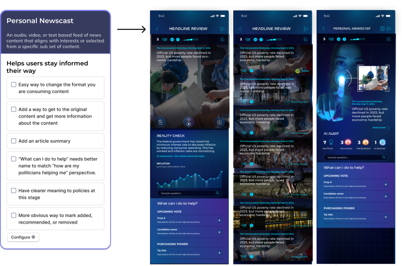
Personal Newscast
This feature offers a way for users to feel like they have an at-a-glance idea of what’s going on that day, with the option to dig deeper if they feel like it. Whether it’s audio, video, or text-based, this feature aligns with user interests, allowing them to engage with political content in the way they prefer.
Pictured left: the design work that is needed now; Pictured right: the design screens that were shown during tradeoff testing that will now be updated.
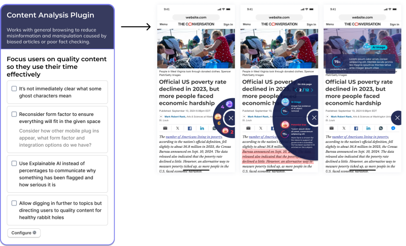
Content Analysis Plugin
This feature serves as something passively collecting monitoring information as you naturally browse political information and the web. It helps flag biased articles, statements, and poorly fact-checked information to help reduce the influence of misinformation and manipulation.
Pictured left: the design work that is needed now; Pictured right: the design screens that were shown during tradeoff testing that will now be updated.
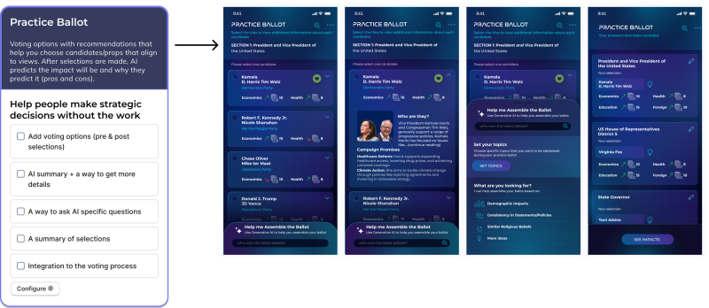
Practice Ballot
The Practice Ballot feature provides a look at how their interests within the political landscape can be affected based on their vote and offers what is being presented within ballots in layman’s terms. The feature is part of a larger effort to make the tool actionable, helping users turn negative emotions (ex. overwhelmed or confused) into hope by helping them feel they are making an informed decision on both local and national levels.
Pictured left: the design work that is needed now; Pictured right: the design screens that were shown during tradeoff testing that will now be updated.
Profile & Activity
As part of any tool, there must be a settings and profile area. The desire for customization and preference filtering was one of the top priorities for users. The settings and activity pages need to incorporate explainable AI and allow users to customize their experience, focused on their opinion of AI-generated content and how they want to interact with it.
A lot has happened in the last 6 weeks. On Day 1, we only had an idea to create an AI product that offered a personalized control panel that provided a "safe space" for users to engage with AI while interacting with digital content. The general goal was to empower users to identify, control, and understand AI-generated material. Pretty broad idea to start.
Fast forward to Week 6, and we’ve zeroed in on a space that provides a real positive impact on the world. We’re building a political AI tool that does just that, helping curb bias and misinformation, helping people save time, stay informed, and make confident political decisions on local, national, and global levels.
We wanted to hear directly from the team about how this tool has evolved in their own minds from Day 1 to now.
"The first few weeks were really weird not having a clear idea of what we were even doing. I’m pleasantly surprised that we did end up going with the political use case, because even though it could end up being the hardest one due to how much there is to balance and how much can go wrong… It's definitely the most impactful and will hopefully have the biggest effect on society.” – Sarah Field, Product Manager
“My initial perception of this tool was more focused on content analysis, and it was challenging to see the difference between this and other tools. Seeing how our concepts have begun to take shape into a refined political tool to address a direct audience has made me more confident that our AI tool can be used by surfacing impact analysis to educate users.” – Celeste Alcon, UX Designer
We also asked if they could only pick 1 thing, what do they believe the most positive impact of this tool is?
“Contributing to a less polarized society, to more well informed election votes, and less anxiety related to news consumption.” – Cygny Malvar, Art Director
“Helping people feel empowered and inspired to get informed and stay engaged.” – Danielle Panigall, Marketing
“The ability to cut through the noise is so big to me. I feel like a lot of the other value adds stem from making these complex topics more approachable to everyone.” – Sarah Field, Product Manager
Next week, we have more testing on the books with 7 participants lined up for in-depth interviews. We’ll be refining the unified design approach and gathering new insights on how the blended concepts work for users.
Between now and then, the team has a lot to accomplish:
It’s going to be another intense week, but we’re excited to see how the new unified concept resonates with users!
Stay tuned for next week’s update!
Check out the weekly writeups below and follow us on LinkedIn to view video summaries!
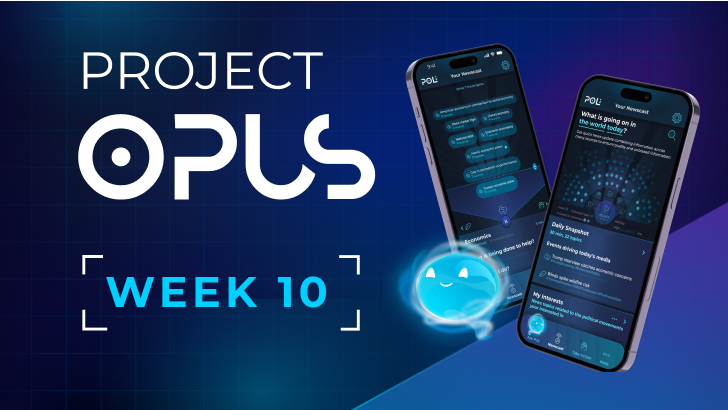
Project Opus: Week 10
Nov 08, 2024
The end of Project Opus is here! See the final Poli product in action by watching the product demo video.
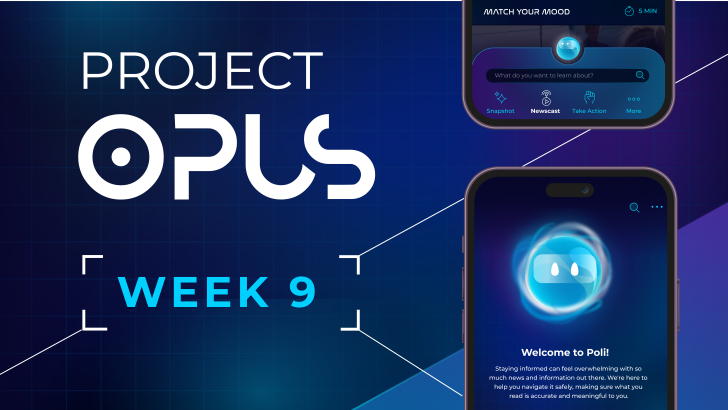
Project Opus: Week 9
Nov 01, 2024
There's only 1 week left of Project Opus, and while the team is off creating the final prototype and product demo video, we're reflecting on how the last 9 weeks went. Check out what the team had to say about the project's highs and lows.
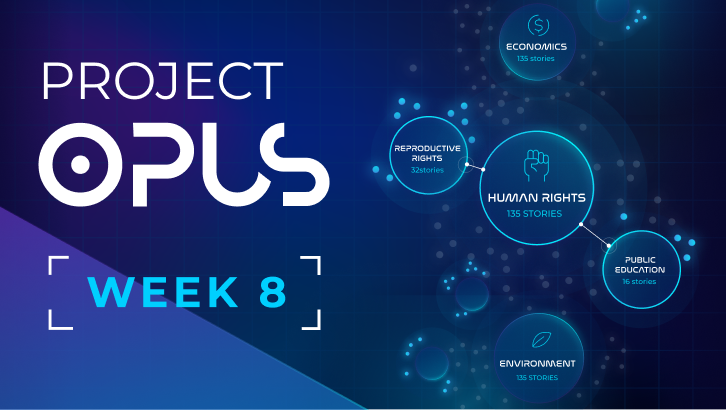
Project Opus: Week 8
Oct 25, 2024
This we met as a whole team twice, once for the user research report readout and again for the final internal design review. It was a big week as we are just 2 weeks away from the project deadline! Check out how the IDIs are impacting the design and what the team had to say.
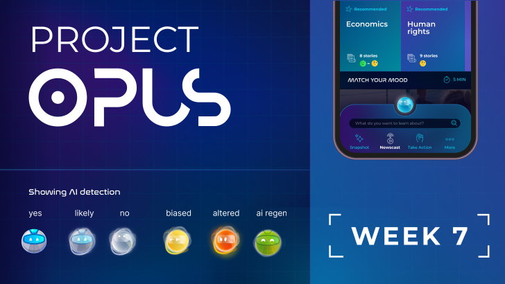
Project Opus: Week 7
Oct 18, 2024
Week 7 of Project Opus brought our final round of user research before we head into the final design stretch. Check out all the collaboration and progress made across test prep, recruiting participants, design updates, prototype creation, and running 7 in-depth interview sessions with users!
