Seizure Safe Profile
Removes autoplay, animations and flashes
A lot has happened the last couple weeks, from defining our product and success criteria to landing on pursuing a political use case for our AI tool and creating MicroDesigns around it. This week was time to start bringing it all together to turn those ideas into polarizing concepts. It was a heavy design week, with the team creating low-fidelity wireframes of 2 different concepts, one a passive and hands-off approach, and the other more guided and intentionally in your face. Welcome to the week 3 recap of Project Opus!
What We Did This Week
We design opposing concepts intentionally, exaggerating ideas to provoke strong reactions during tradeoff testing. During this stage we are intentionally designing things that we know won’t be in the final solution, but it allows us to bake in failures for us to learn from and improve in the design. By stretching features to the extreme, it encourages users to express strong opinions during testing, both positive and negative, that give us valuable insights into what resonates and why. As designers, what we don’t want to hear during testing is, “It’s fine”, because there’s not much we can learn from neutral feedback like that.
The goal is gather data that helps us refine and improve, so we purposefully design for tensions—different opinions, values, and needs. This allows us to see how users navigate the extremes and tradeoffs to then be able to combine the elements that work well for a holistic solution. But in order to get that information, we need to create design concepts on opposite ends of the spectrum.
Last week, we landed on pursuing a political use case, and this week we set out to design initial concepts for a political AI tool that helps users consume news and content their way while combating misinformation, bias, and AI generated or altered material to allow people to make informed decisions when it comes to politics.
Our designers brought two distinct concepts to life with low-fidelity wireframes. Each were presented and discussed midweek on a team internal review call. Here's a high level look at what each was all about.
Concept 1: Informative and Neutral (Plug-In)
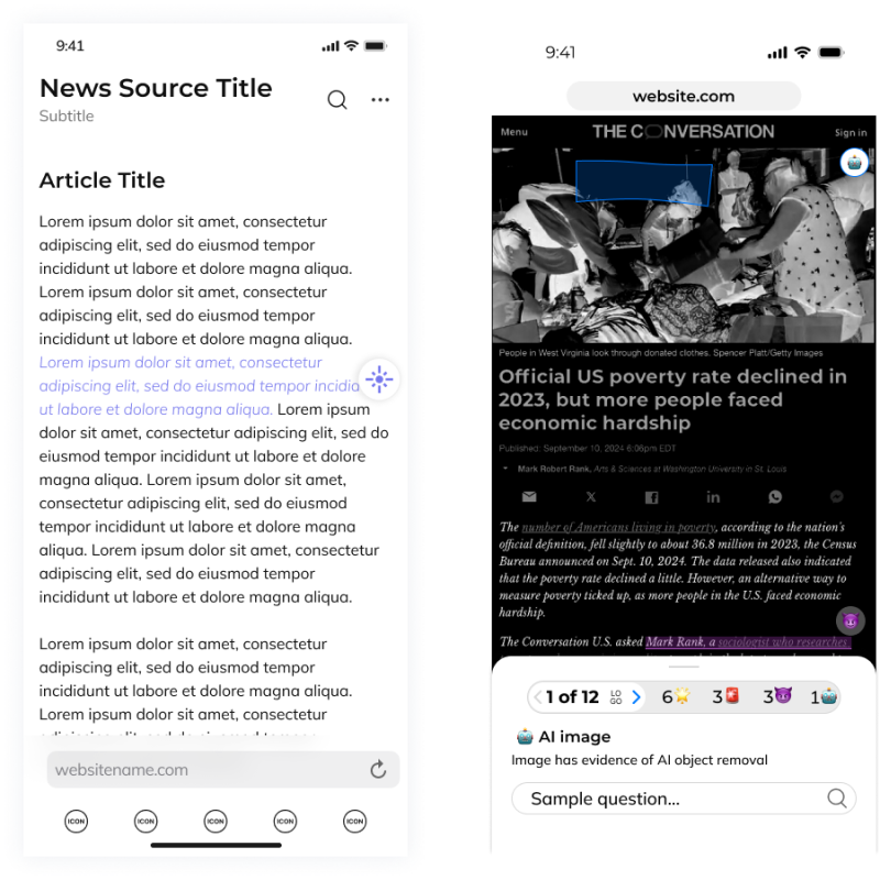
This concept is for users who value transparency without disruption. It passively monitors content as users browse the web, highlighting bias, misinformation, and AI-generated content in real time. The plug-in works in the background and has minimal footprint in users' daily life, designed to be passively observing political information you’re interacting with online and presenting you additional context on bias or emotionally charged sentiments so that you can make your own informed decision on what you are seeing.
This approach is designed for people who prefer minimal interaction and seek out information on their own. It aims to offering insights when needed and allows individuals to make informed decisions independently, without overwhelming them with constant updates.
Concept 2: Guided and Engaging (Web-App Solution)
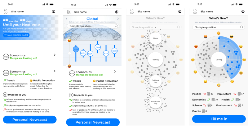
This concept is aimed at users who feel overwhelmed by political content and tend to avoid it. The web-app approach is intentionally the opposite of Concept 1, taking an action-forward and more “in your face” approach to the information it offers. This concept makes navigating political news easier by offering guidance and helping users understand complex topics and how the information they are consuming aligns with their values.
Unlike the passive plug-in, this web-app is for users who want more engagement. They intentionally access it when ready, receiving clear, concise summaries and deeper insights into political topics. The app acts as a supportive guide to not only help you make decisions on how to vote and policy implications but highlights bias, misinformation, and content that may be fully generated, or altered, by AI.
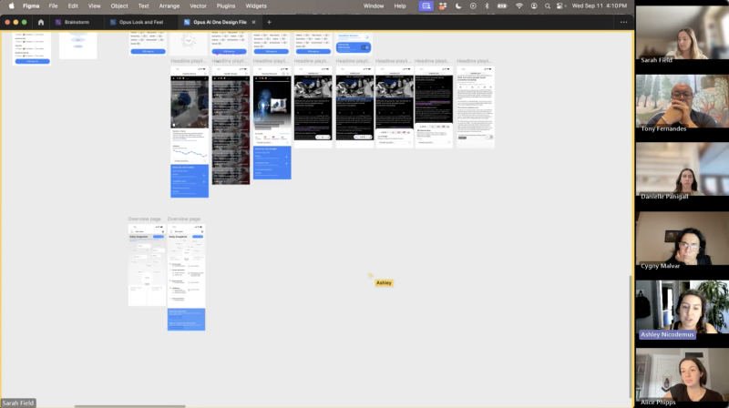
On Wednesday, the team met for an internal design review to critique and refine both concepts ahead of testing. The designers shared low-fidelity wireframes that explored various data visualizations, ways to show connections between political topics, and even played with ideas like letting users “drive” through political content paths. Some designs worked while others fell flat, but the discussion was an important one to make sure Concepts 1 and 2 were distinct enough from each other to provoke various reactions during testing.
Key Meeting Feedback:
The designers have already started making refinements and working to finalize the concept screens that will be shown to users.
It was a busy time for the design team, because we also kicked off visual design exploration. In next week's testing, we want to have look and feel options applied to the concepts to help bring them to life even further for users. For now, we’re keeping these visual explorations under wraps, but we will share all the details once concepts are finalized and the visual directions are applied. We can’t wait to show you what’s in store!
Last but not least, this week we launched and collected responses from a research survey with two key objectives:
A total of 65 participants, from UEGroup’s research database, provided insights into their political news habits, emotions around AI and AI tool usage, and thoughts on online sources.
Top 5 Takeaways:
The insights collected helped us to understand more about users in the context of political content consumption and get a better idea of what they are currently experiencing when it comes to AI and politics. Next steps are to identify 10 participants to join the 1-hour remote focus group sessions next week.
“I feel like this space is prone to people who might say they want to be aware of bias or opposing views, but in reality, might be resistant to that. I'm excited to start digging into that, and what it could translate into for the product.” –Sarah Field, Product Manager & Senior UX Designer
If all goes according to plan, this is what the teams schedule looks like next week.
Stay tuned for more updates as we enter an exciting new phase of Project Opus where things actually start to look real (and pretty)! To see this week's video recap, follow along on LinkedIn.
Project Opus: Week 10
Nov 08, 2024
The end of Project Opus is here! See the final Poli product in action by watching the product demo video.
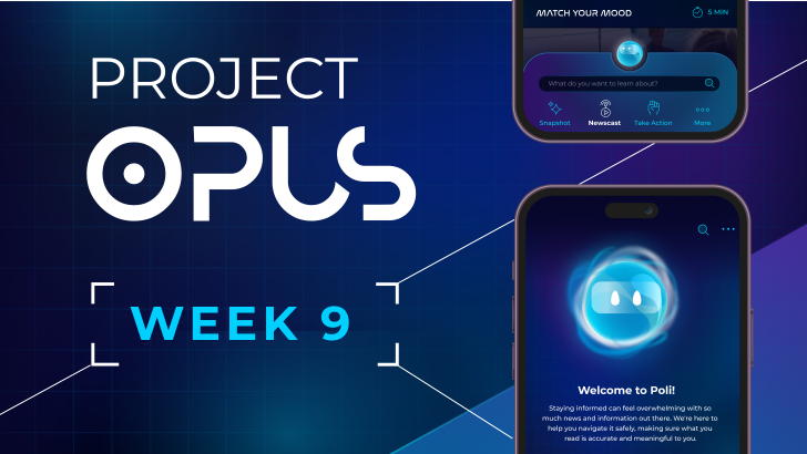
Project Opus: Week 9
Nov 01, 2024
There's only 1 week left of Project Opus, and while the team is off creating the final prototype and product demo video, we're reflecting on how the last 9 weeks went. Check out what the team had to say about the project's highs and lows.
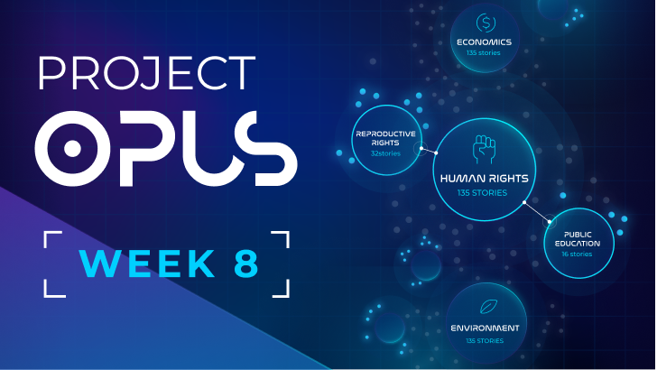
Project Opus: Week 8
Oct 25, 2024
This we met as a whole team twice, once for the user research report readout and again for the final internal design review. It was a big week as we are just 2 weeks away from the project deadline! Check out how the IDIs are impacting the design and what the team had to say.
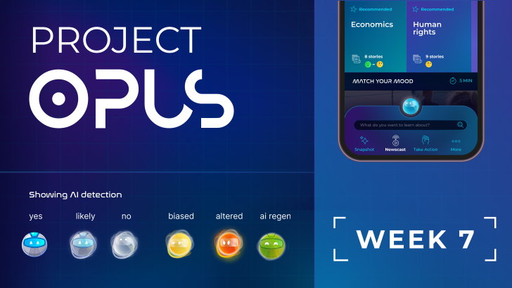
Project Opus: Week 7
Oct 18, 2024
Week 7 of Project Opus brought our final round of user research before we head into the final design stretch. Check out all the collaboration and progress made across test prep, recruiting participants, design updates, prototype creation, and running 7 in-depth interview sessions with users!
