We’ve officially hit the halfway mark of Project Opus! The political AI tool we’re creating in 10 weeks from the ground up is starting to take shape, and this week saw a 2nd round of tradeoff testing research, insights synthesis, and more design work to explore customization controls. It’s been a busy week for both research and a lot of design work happening behind the scenes.
Before you dive into what came out of tradeoff testing in this post, head to the previous week’s recaps to get caught up.
Let’s dive into week 5!
This week, we wrapped up the 2nd round of tradeoff testing with remote focus groups. We’re gathering feedback on two polarizing design concepts: one that’s guided and front-and-center, and another that’s more passive and non-disruptive.
In Round 1 we had a 60-minute session with four participants, but time got away from us, and we were only able to showcase one concept. Since the goal was to compare both designs to understand tradeoffs, preferences, and priorities, we knew we had to conduct another round to get the full picture. Overall, the feedback on the Passive design concept was positive, but without insights on the counter Guided concept, we were missing crucial insights.
In Round 2, which happened Wednesday, we increased the session time to 90 minutes and restructured the session to ensure we had time to show both concepts. We trimmed the intro questions to give us more time for the main event, going over content analysis, daily snapshots, headline playlists, and ballot concepts. To eliminate order bias, the Guided concept was shown first to this focus group of 3 participants. Special shoutout to Alice, our user researcher, who pulled together a second focus group within just three days!
The team is now synthesizing the results and will be presenting findings at the end of the week, guiding our next steps for design.
Top 4 Takeaways:
- Level of Guidance: Users want both options; an entry point for news when they’re in the mood to dive deep into information, and protection and monitoring when browsing casually offering additional insight on what they are viewing.
- Content Curation: They appreciate curated content to save time but still want to see other perspectives and opposing viewpoints.
- Level of Detail: Users want control depending on the situation. More detail can pull users into rabbit holes, but they still want it the ability to go down those paths with features that offer them control over what they are consuming. There are situations where a simply indication of bias, misinformation or AI generation is acceptable without needing to do a deeper dive.
- Level of Disruption: While disruption is useful to prevent doomscrolling, users don’t want it all the time. Snooze features or placing interruptions at natural breaks could strike the right balance.
Some additional high-level takeaways:
- Participants like elements of both concepts, and their preferences are dependent on how much time they had available and what information they want to consume that day.
- If they have time, they want more in-depth materials and learning opportunities.
- If they were in a hurry or overwhelmed, digestible news and reminders about rabbit holes were preferred.
- Control is key. Users want options for how much the app interacts with their news consumption and to customize their experience.
- Features that help users navigate complex content (like fact-checking and AI vetting) are highly valued and free up emotional bandwidth for users to form opinions.
- Behavioral disruption features like “Rabbit Hole” or “Bubble Burst” were well-received but should come with a snooze function for more control.
“Being able to personalize the experience users want to have with this tool is going to be critical, and that includes things like topics that interest them, how frequently they want to be notified of things, and how much they want to be blocked from seeing. A lot of that is going to be critical in making the difference between a tool that’s annoying and easily dropped vs. something that’s actually beneficial and guiding users behavior in the right direction.” –Sarah Field, Product Manager & UX Designer
While tradeoff testing was taking place, the design team has been hard at work, pushing forward with customization controls. While we’re still digesting the feedback from the focus groups, it’s clear that personalization is going to be a cornerstone of this tool.
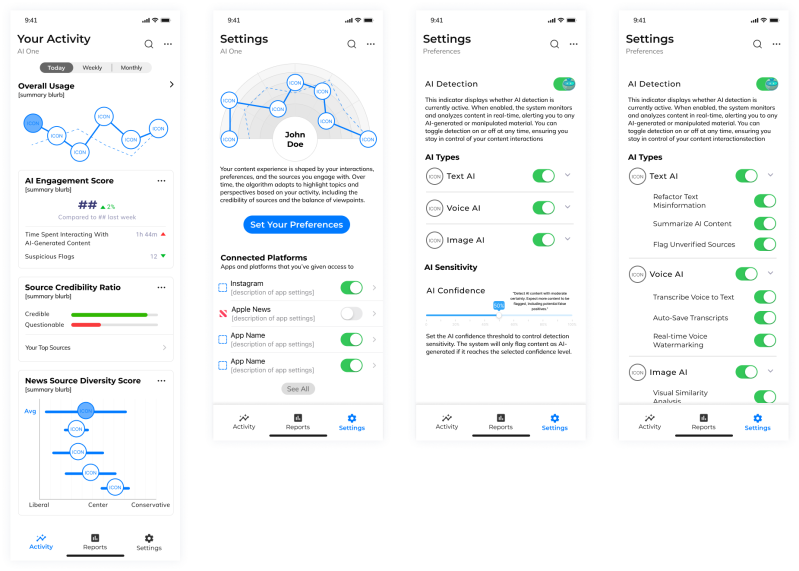
This week, the team focused on defining personalization within settings, including controls for political topics of interest, how much AI intervention they want, and how often they want to be blocked from certain content. It’s all about finding that right balance between being helpful and being intrusive.
Explorations (pictured below) included an activity page that visualizes the user’s data exposure, showing how AI is working behind the scenes to protect them. We’ve also started fleshing out settings for things like “AI Confidence,” where users can decide how strict the app should be in flagging content that’s AI-generated.
The team is off creating the research report and analyzing the insights from both focus groups. These insights will decide which elements from both design concepts will move forward with and the direction a combined design approach will need to take to deliver across all user viewpoints. The challenge will be keeping the experience consistent and providing a tool that supports their individual journey with politics, not just a series of features.
Next week, we’ll be sharing into the design impacts of this testing and how the concept will evolve as we prep for yet another round of testing in 2 weeks. This time it will be traditional user testing, where we’ll put the AI tool in front of users and see how it performs in terms of usability, value, and where we can push it further.
- Challenge: There are a lot of balls in the air now across research and design with a lot of work happening in parallel. We knew going into this it was going to be a challenge to stick to our tight 10-week timeline, and this is one of those weeks where we are designing while we’re synthesizing. It’s been a balancing act to keep both moving forward without wasting time.
- Win: Despite the hiccup in Round 1, we pulled off Round 2 of tradeoff testing in just three days, and the extended time allowed us to get all the insights we needed!
- Whoops: Luckily, no major whoops this week! We quickly adjusted our testing plan and were able to keep everything on track. Looking forward to seeing how the design is impacted from the insights.
Next week, we’ll have a full readout of the tradeoff testing results and a clear direction for how to combine the best parts of both concepts into one cohesive design. From there, the team will have about a week and a half to pull together the new design before it’s time for user testing.
Stay tuned!
Check out the weekly writeups below and follow us on LinkedIn to view video summaries!
- Week 1 Writeup & Recap Video
- Week 2 Writeup & Recap Video
- Week 3 Writeup & Recap Video
- Week 4 Writeup & Recap Video

