Simplify Framework and Navigation
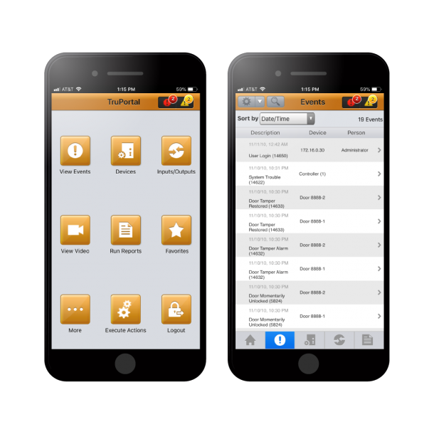
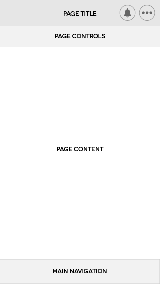
Diving into the design process, our first step was to boil down the many pages and types of information into a simplified framework. Our framework was based on the main tasks a user would want to accomplish from a mobile device:
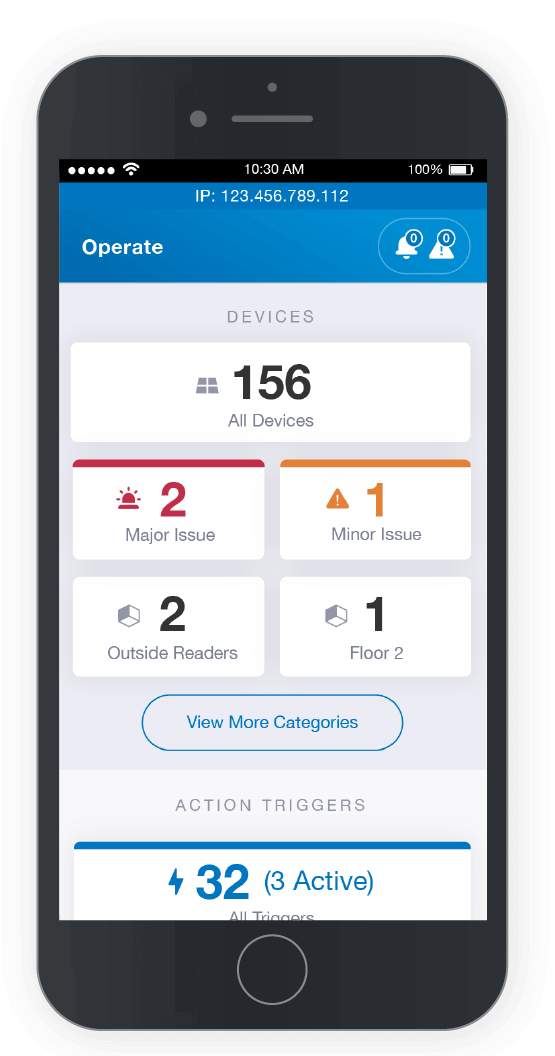
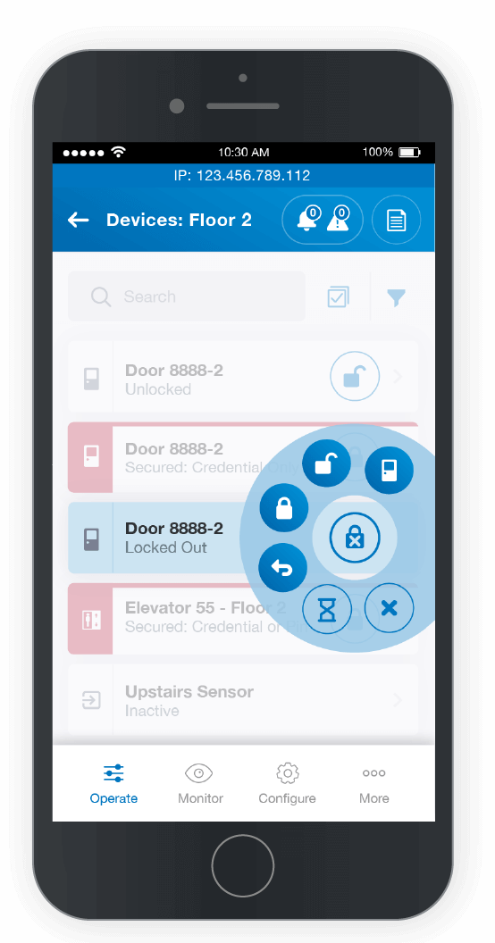
- Operate: Changing the state of devices, such as locking/unlocking doors
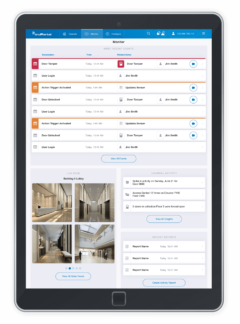
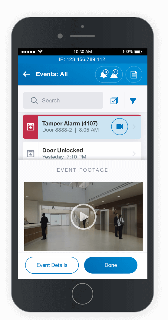
- Monitor: Keep an eye on event activity and live security footage
- Configure: Set up system objects such as access levels and device schedules
Optimizing the framework around these use cases allowed for efficient workflows and showing the right information at the right time.
Highlight Status through a Consistent Visual Language
Users of this application could be dealing with hundreds of devices and event activity. Knowing when something needs attention is very important for the user, so we wanted to surface important status indications in a clear way.
We developed a consistent treatment for each object in the system (such as doors, camera, and events) that included icons for quick object recognition, red coloring for warnings, orange coloring for cautions, and neutral coloring for anything that didn’t need to stand out. This consistency and highlighting of important status allow users to understand information at a glance and take action on what matters most.
