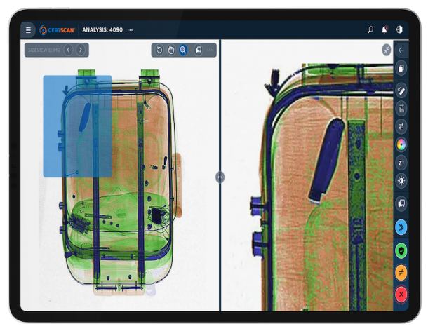
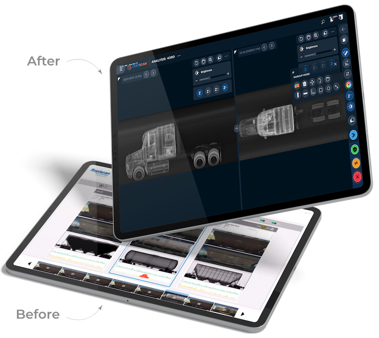
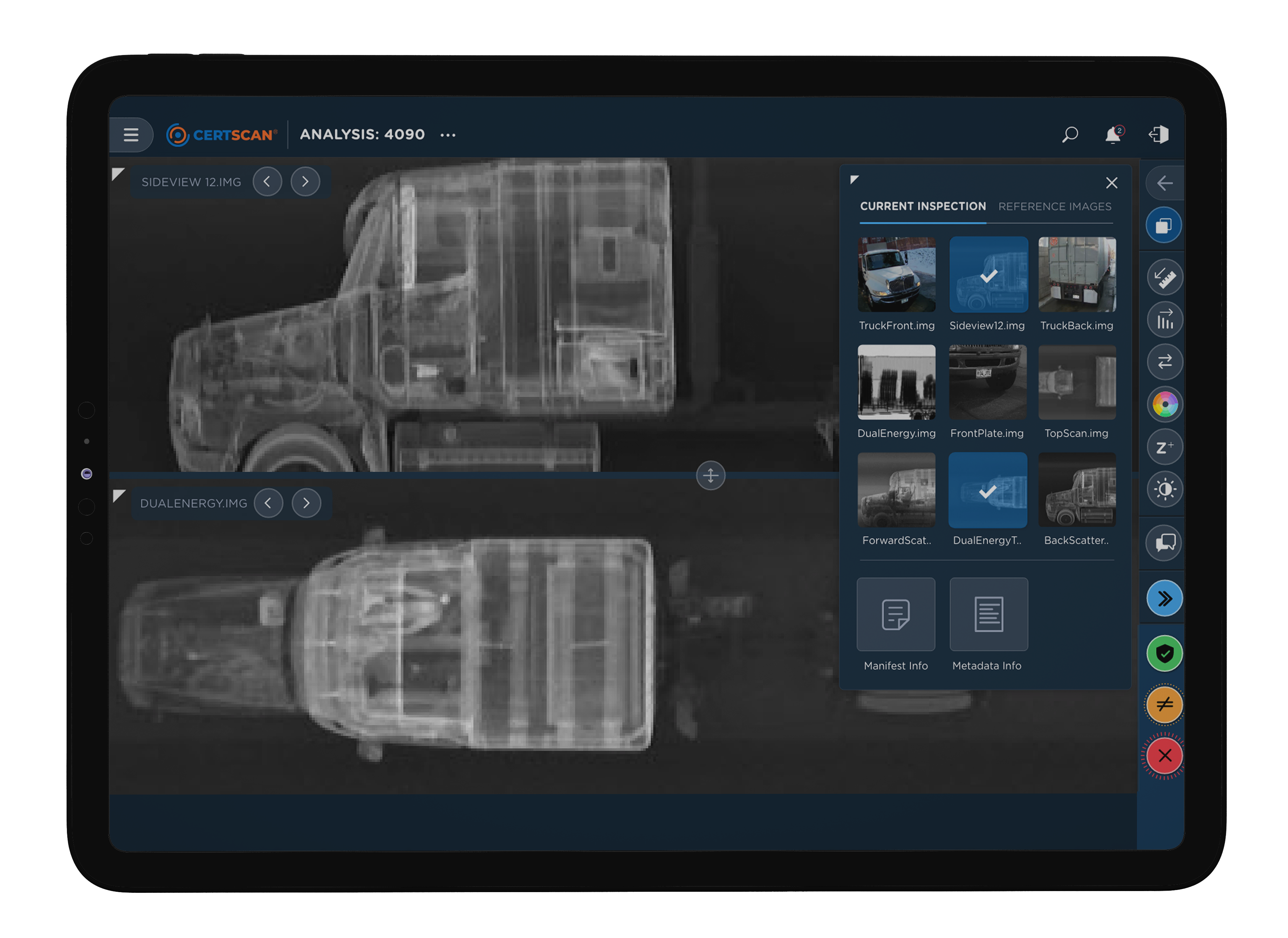
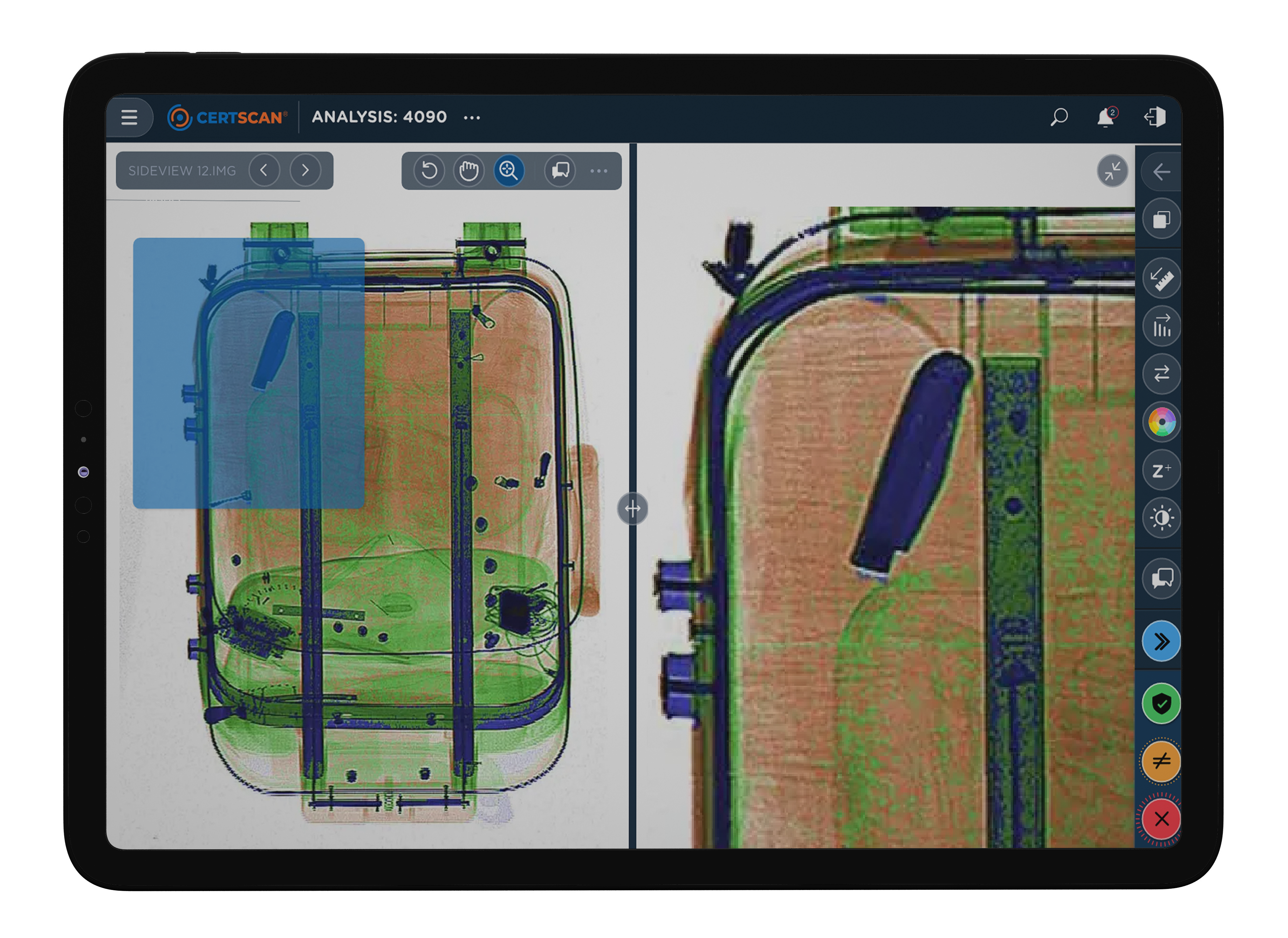
Before diving into the redesign, we conducted interviews with key CertScan users and stakeholders to uncover their pain points and mental models. These interviews revealed inspectors had mentally taxing and fast-paced workdays, at times making it difficult for them to stay on high-alert while performing critical responsibilities. The system also required them to navigate through disparate parts of the interface to complete essential tasks, ultimately slowing them down and hindering intuitive workflows.
Using discovery insights, we shaped our design approach to create a more guided, adaptable, and zeroed-in platform. We generated contrasting prototype concepts to illicit user reactions and assess trade-offs between stakeholders and users during research rounds. Both usability testing and rapid feedback cycles were integrated throughout the process to ensure the final design met user needs, technical constraints, and the business goals of stakeholders.
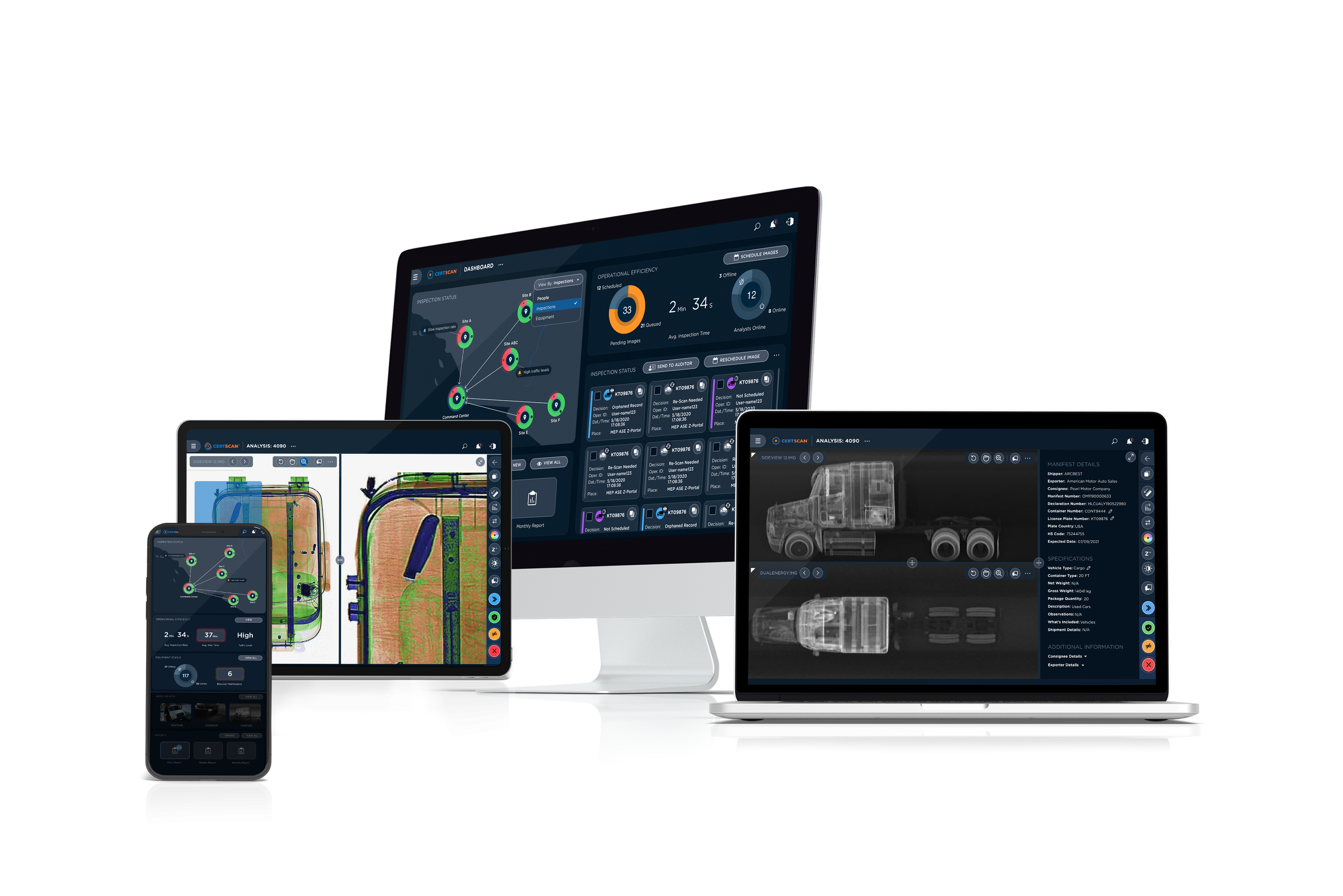
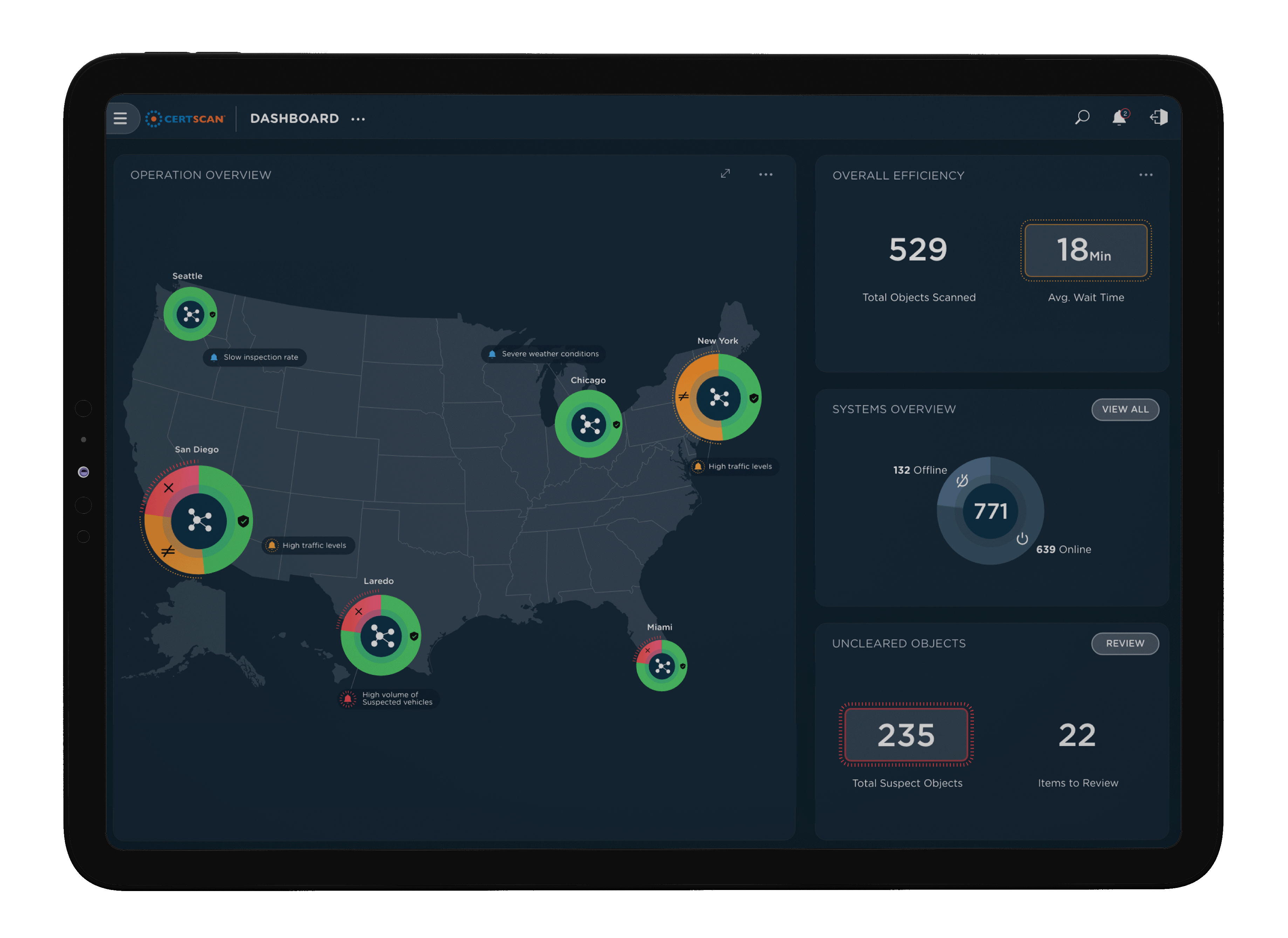
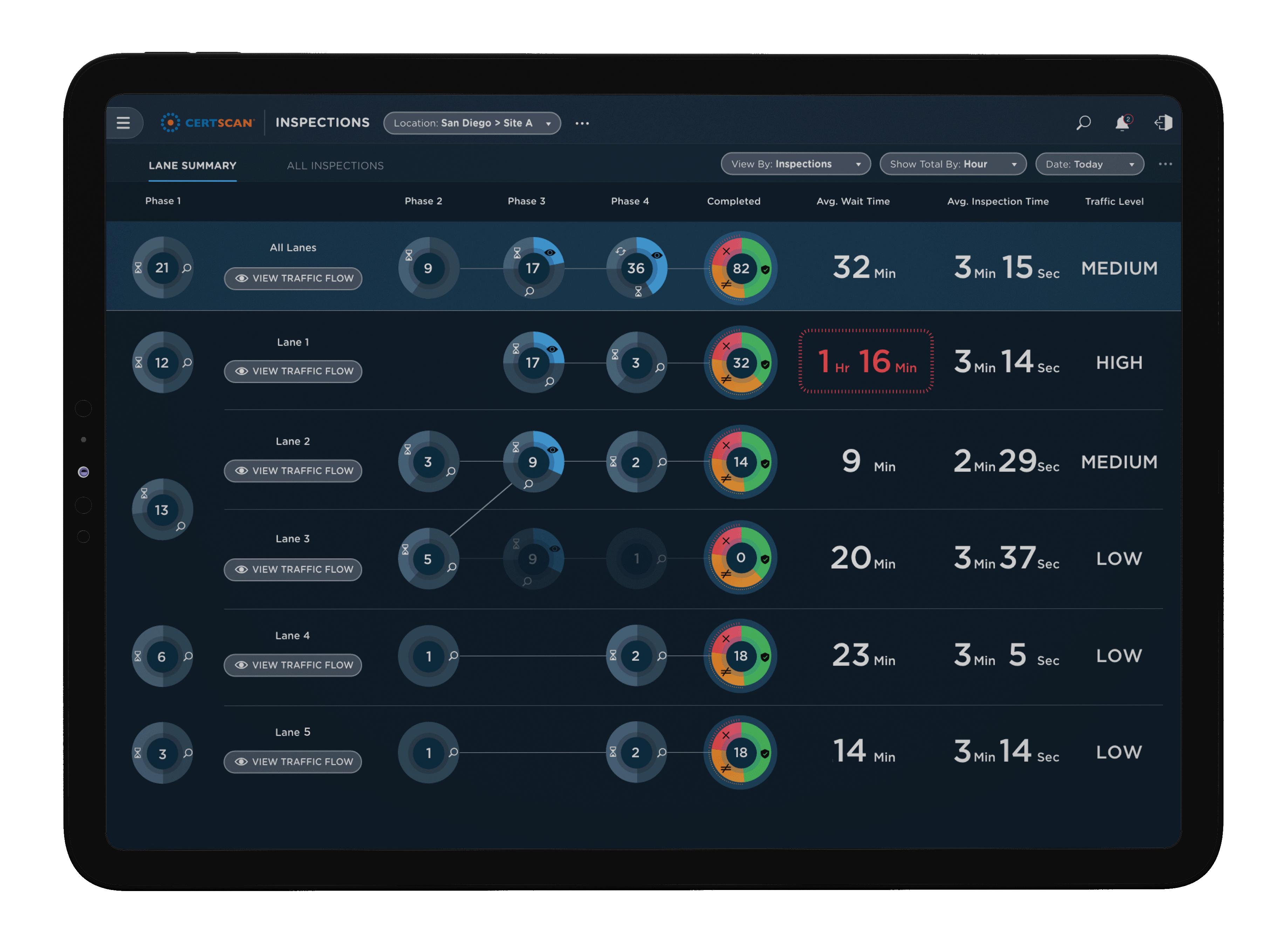
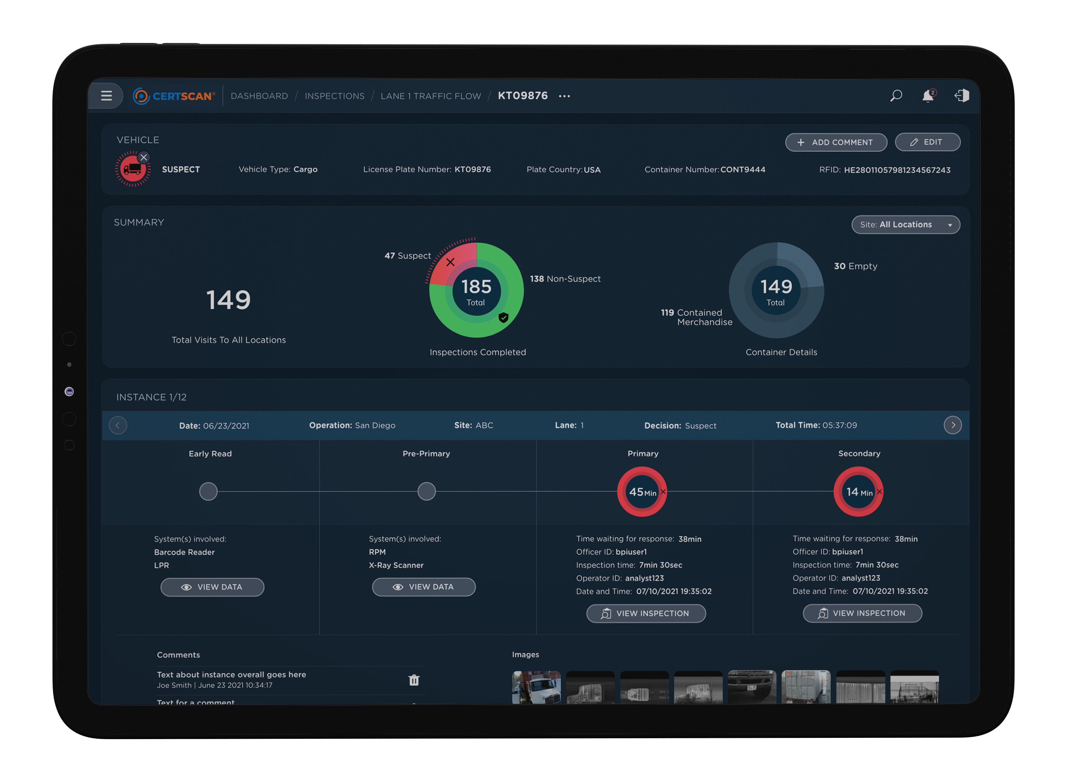
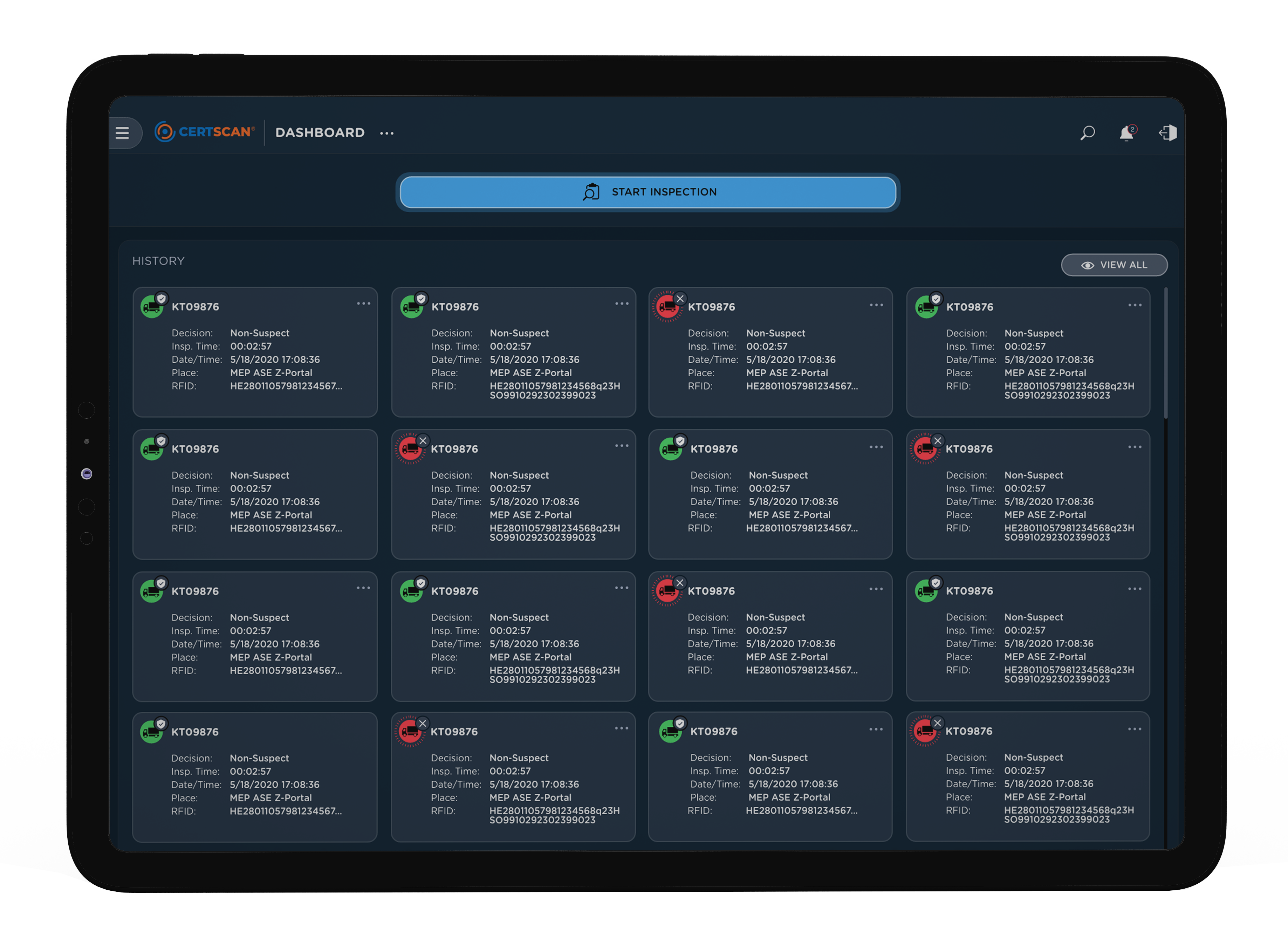
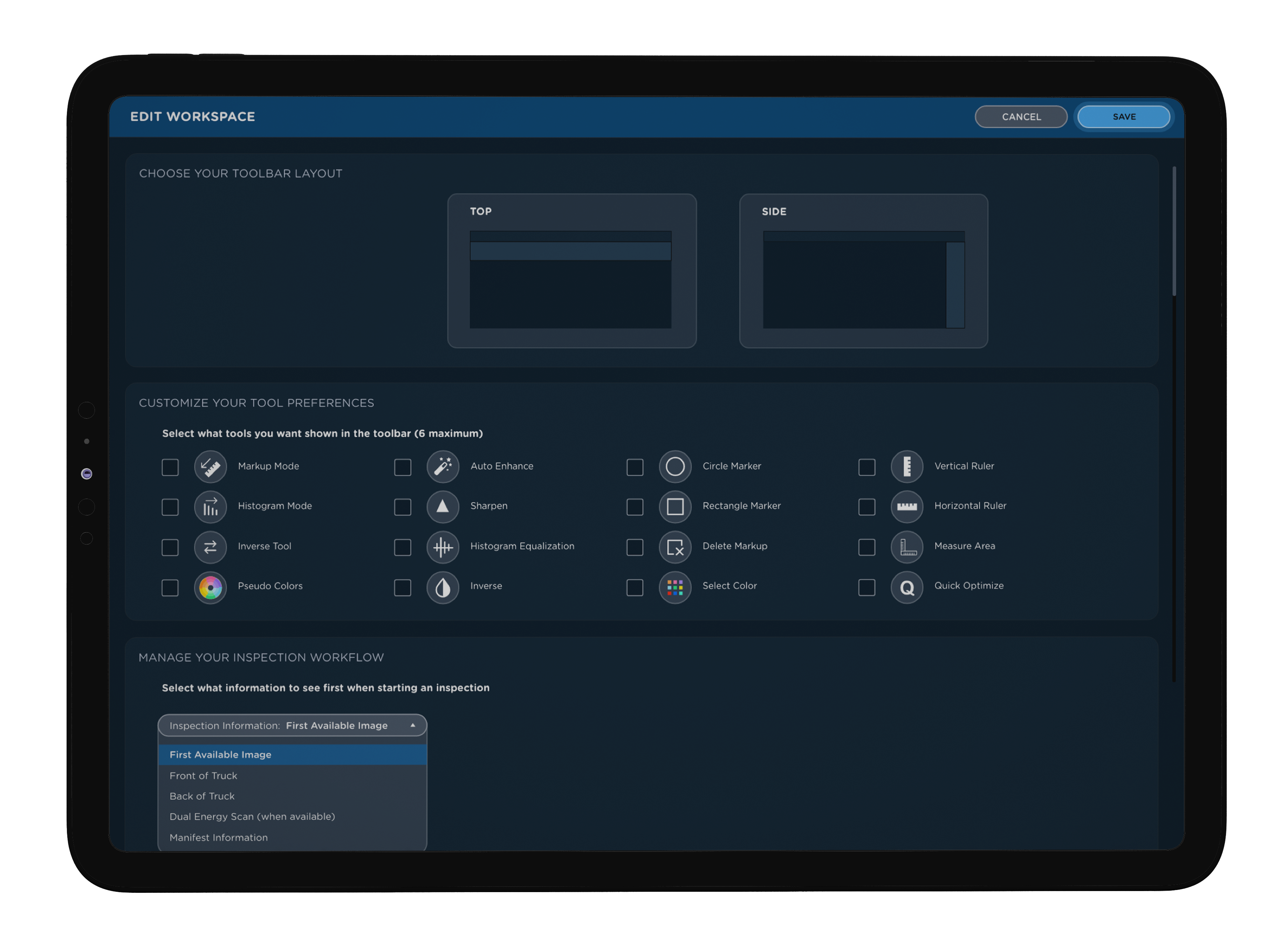
Recognizing that each user looks at system data differently, we aimed to present the right information at the right moment in their workflow to enhance efficiency and intuitiveness. We introduced actionable data visualizations and created a role-based user experience, tailoring the interface to each user type and their unique tasks. Field personnel now had streamlined access to frequently used controls, while data analysts could simultaneously track inspection durations and tool usage. This approach provided users with the flexibility to zoom in for detailed information or zoom out to gain a broader system perspective as needed.
